Best Wall Art Worth Buying for Your Home — The Room Element That Changes Everything
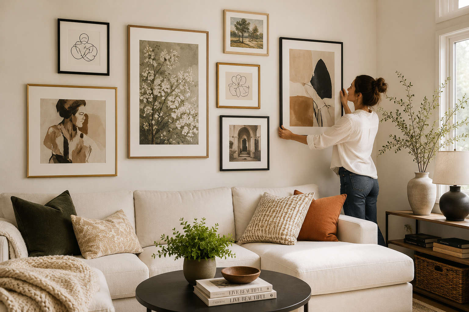
The wall is the largest surface in any room and the one that most homes treat as the last priority. Furniture gets deliberated over. Rugs get measured and returned and measured again. But the walls — which represent more square footage than every piece of furniture in the room combined — end up covered with whatever arrived without much thought. The print that was bought because it was on sale. The family photo that was framed because it needed to go somewhere. The mirror that fills space without adding anything specific to the room.
Getting wall art right changes how a room reads more completely than almost any other single decision. The right art makes a room feel finished and intentional, as though someone actually made choices about this space rather than assembling it over time. The wrong art — or no art — makes a room that's otherwise carefully considered feel incomplete in a way that's difficult to name but immediately felt by anyone who spends time in it.
Products
Wallshoppe Curated Art Prints
 Buy Now
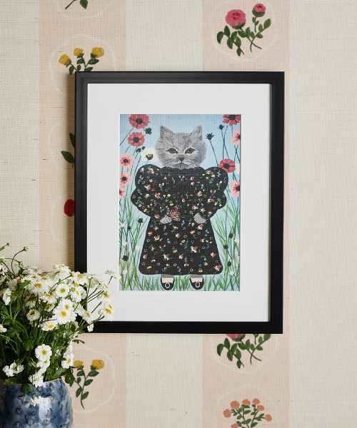
Wallshoppe produces art prints in a genuinely curated collection — the curation is editorial rather than comprehensive, meaning the selection reflects actual choices about what's worth printing rather than an attempt to offer everything. The aesthetic range covers botanical illustration, abstract form, textural work, and landscape-influenced pieces in the specific color palettes that contemporary interiors respond to without being trend-specific. The printing quality is consistently above what the price suggests, and the sizing options are comprehensive enough to find the specific dimensions a wall requires.
- Price: From $35 for prints; more for framed
- Available at: Wallshoppe (wallshoppe.com)
- Best for: Those who want genuinely curated contemporary art prints where the editorial standard means the quality floor is high — the starting point for a gallery wall or a single statement print
Wallshoppe Framed Prints
 Buy Now
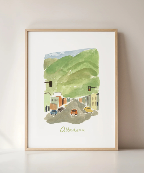
Wallshoppe offers framing alongside their prints, and the specific advantage of buying the frame and print together from Wallshoppe is calibration — the mat border width and frame proportions are designed for the specific print dimensions rather than being standard frame sizes that may or may not suit the art. The frames arrive with the print already mounted and ready to hang, which removes the effort from what is otherwise the most time-consuming part of putting art on walls.
- Price: From $75 for framed prints
- Available at: Wallshoppe (wallshoppe.com)
- Best for: Those who want the complete, hang-ready result rather than the print alone — the option that removes the framing process and ensures the proportions are right
Wallshoppe Large Format Prints
 Buy Now
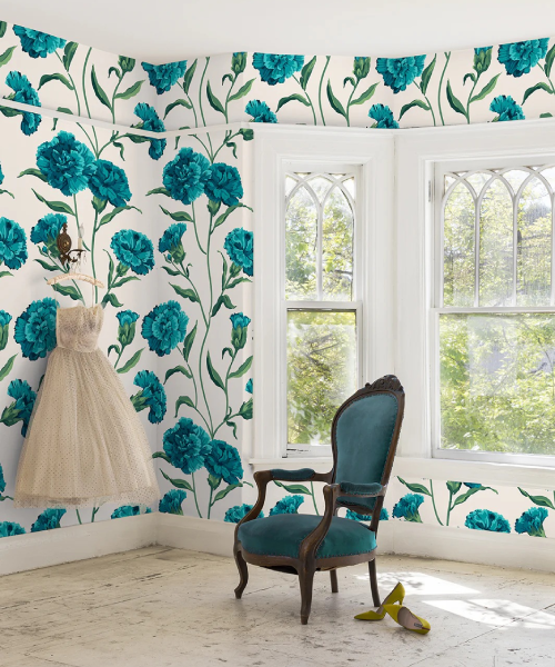
The most consistent wall art mistake is buying prints that are too small for the wall. A print that looks substantial in product photography can look insignificant on an actual wall next to actual furniture. Wallshoppe's large format options address this with prints available in sizes that hold walls properly — the 24x36 and 30x40 options that work on walls above sofas and on feature walls in the way that smaller prints rarely do.
- Price: From $85 for large format
- Available at: Wallshoppe (wallshoppe.com)
- Best for: Those who want one significant piece that holds a wall rather than a gallery arrangement of smaller prints — the large format that makes the statement a wall needs
Scale — The Variable That Makes or Breaks Wall Art
The most important wall art decision is scale, and it's the one that most people get wrong consistently. The instinct when buying art is to choose a size that seems reasonable in the context of the shopping experience — on a website, relative to the screen, or in a shop, relative to a display wall. In the actual room, on the actual wall, these sizes are almost always too small.
The proportion rule that produces consistently good results: art or a grouping of art above a piece of furniture should be approximately two-thirds of the width of that furniture. For a sofa that's 200cm wide, the art should be approximately 130cm wide — either a single large piece or a grouping that spans that width. Most people choose art that's 70-80cm wide for the same sofa, which looks modest against the furniture scale.
The alternative approach for rooms where this feels too large: a group of smaller pieces that collectively span the right width, with enough cohesion through frame color or subject matter to read as an intentional arrangement rather than a collection of random pieces.
Height — The Other Variable People Get Wrong
Gallery hang height — 57 inches or approximately 145cm from the floor to the center of the piece — is the standard because it places art at eye level for the standing adult, which is where art is designed to be seen. Most people hang art higher than this, often significantly higher, because it "feels like it should be up there" near the ceiling. The result is art that's disconnected from the furniture and the room below it, and that requires looking up to see properly rather than being encountered naturally.
The specific exception: art hung above furniture where the furniture height plus the standard gap and then the center of the art places it higher than the gallery standard. The gap between the top of a piece of furniture and the bottom of the art should be 15-20cm — enough to read as related to the furniture without being cramped against it.
Building a Gallery Wall Without a Design Background
A gallery wall that reads as intentional has almost always been planned rather than assembled instinctively, and the planning method that works is low-commitment before high-commitment.
Gather all the pieces you're considering. Lay them on the floor in the arrangement you're thinking about. Take a photo from standing height. Look at the photo — it shows the proportions more clearly than looking at the floor arrangement because it's a flattened view. Adjust until the floor arrangement looks right. Then trace each frame shape onto paper, cut out the paper pieces, and tape them to the wall with low-tack tape. Live with the paper arrangement for a day. Adjust if needed. Then hang.
This process eliminates the filled-hole problem that comes from hanging by intuition and from adjusting the actual work once it's on the wall. The time investment in the floor and paper stage saves significantly more time than it costs in the actual hanging stage.
What Gives a Gallery Wall Coherence
A gallery wall reads as collected and intentional when there's a consistent element running through the pieces, even when the pieces themselves are varied. The consistent element can be frame color — all black, all natural wood, all white, all the same finish. Or mat color — the same cream or white mat across different frame styles. Or subject matter — all botanical, all abstract in the same color family, all black and white photography. Or size relationship — all similar sizes, or a clear hierarchy of one large anchor piece and several smaller ones.
What doesn't produce coherence: a mix of frame colors, mat styles, print sizes, and subject matters that share no connecting element. This reads as accumulated rather than chosen, which is the specific quality that gallery walls are supposed to overcome rather than reinforce.
Conclusion
Wall art is the room element whose absence is most felt when it's wrong and whose presence is most transformative when it's right. Wallshoppe produces genuinely curated contemporary prints at prices that make building a gallery wall financially reasonable rather than aspirational. The scale principle — larger than your instinct suggests — is the single most consistently applicable piece of advice for any wall art decision. And the planning process — floor arrangement, paper templates, then hanging — produces the gallery wall that looks deliberate because it was deliberate. Get the scale right and hang at gallery height, and the art does the work of making the room feel finished.
Every product here was chosen by an editor from the public record — verified buyer reviews, independent testing and the brand’s own documentation — before any commercial conversation happened. If you buy through a link on this page we may earn a commission, at no cost to you, and it never decides what we recommend. Read the full policy.
Editorial Team
Every recommendation on Decor Imperial is researched by our editors from the public record — verified buyer reviews, independent testing, owner communities and the brand’s own documentation — before it appears here. We earn a commission when you buy through our links; no brand sees a review before it is published, and none has ever changed one.
Keep Reading
All stories Home & Decors
Reasn Review: Is This Size-Inclusive Fashion Brand Worth It?
Home & Decors
Home & Decors
Reasn Review: Is This Size-Inclusive Fashion Brand Worth It?
 Home & Decors
Nathan James Furniture Review: Great Customer Service, Mixed Quality
Home & Decors
Home & Decors
Nathan James Furniture Review: Great Customer Service, Mixed Quality
 Home & Decors
McGee & Co Review: A Catalogue That Coheres, and Furniture That Does Not Arrive
The Studio McGee catalogue is built so that everything in it sits together, and on décor and textiles the buyers agree. Large furniture is the problem: a $6,000 bed unshipped at six months.
Home & Decors
Home & Decors
McGee & Co Review: A Catalogue That Coheres, and Furniture That Does Not Arrive
The Studio McGee catalogue is built so that everything in it sits together, and on décor and textiles the buyers agree. Large furniture is the problem: a $6,000 bed unshipped at six months.