Soft Color Home Decor Ideas That Make Your Home Feel Calm, Not Lifeless

Introduction

Soft colors are easy to love.


Cream walls, pale green cushions, dusty blue bedding, a beige rug, maybe a little warm wood somewhere — it all sounds calm and pretty.


But then you try it in your own room and it doesn’t always feel the same. Sometimes the room looks too pale. Sometimes everything blends together. Sometimes it feels peaceful in the morning but dull at night. You look around and think, “It’s nice, but something is missing.”


That’s the problem with soft color home decor. The colors are gentle, but they still need support.


A room can be soft without being boring. It can feel calm without looking empty. You just need a little texture, a little warmth, some natural materials, and a few deeper details so everything doesn’t disappear into one pale blur.


Soft colors work best when the room feels lived in, not overly styled.

Soft Color Home Decor Ideas That Make Your Home Feel Calm, Not Lifeless

Quick Answer

Soft color home decor looks best when you mix gentle shades with texture, warm lighting, natural wood, plants, and a little contrast. Use colors like cream, beige, taupe, sage green, dusty blue, soft brown, muted peach, warm gray, and pale terracotta. Keep the room calm, but don’t make every piece the same color.

Why Soft Colors Feel So Good at Home

A lot of people want their home to feel calmer.


Not empty. Not cold. Just easier to relax in.


Soft colors help because they don’t demand too much attention. They make a bedroom feel restful. They make a small living room feel lighter. They make a rental feel less harsh. They also work with many styles, from cozy neutral decor to more natural, relaxed spaces.


But soft colors can fall flat if the room has no layers.


A pale sofa, pale rug, pale curtains, and pale walls can look nice at first, but after a while the room may feel unfinished. It needs something to hold it together.


That might be a wooden table. A woven basket. A warm lamp. A plant in the corner. A clay vase. A textured throw. Small things, really, but they make the room feel warmer.


Soft colors are not the whole story. They’re the background. The rest of the room still has to do some work.

Start With One Main Soft Color

The easiest way to avoid a messy color scheme is to start with one main color.


This is your base.


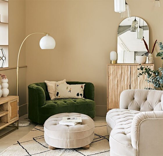
It could be cream walls, a beige sofa, taupe curtains, a warm white rug, or soft gray bedding. Whatever takes up the most space in the room becomes the color everything else has to work with.


Good soft base colors include cream, warm white, beige, oatmeal, taupe, soft greige, and very pale warm gray.


Try to avoid anything too cold if the room doesn’t get much sunlight. A sharp white or cool gray may look clean online, but in a real home it can feel a bit lifeless, especially at night.


Cream usually feels easier than bright white. Taupe feels warmer than gray. Beige can look beautiful, but only if you add enough texture and depth.


Once the base is clear, add one or two gentle accent colors.


A cream room can take sage green, dusty blue, soft clay, or muted peach. A beige room can work with olive, soft brown, warm white, or dusty rose. A taupe room can look lovely with natural wood, cream, black accents, and soft green.


You don’t need too many colors. In fact, fewer usually feels better.

Don’t Match Everything Too Perfectly

This is where soft color rooms can start looking boring.


Everything matches too much.


Cream sofa. Cream rug. Cream curtains. Cream cushions. Cream throw. Cream vase.


It sounds peaceful, but it can look flat.


A soft color palette home needs small changes in tone. The colors can still be gentle, but they should not all be identical.


Mix cream with taupe. Beige with soft brown. Warm white with sage. Dusty blue with wood. Pale peach with clay. Soft gray with cream and olive.


Those small differences help the room feel layered.


It’s like wearing neutrals. If every piece is the exact same shade, it can look a little unfinished. But when the shades are close, not identical, everything feels more natural.


Soft decor should not look like one color copied across the whole room. It should feel quiet, but still have movement.

Texture Makes Soft Colors Feel Warm

If your soft-colored room feels dull, don’t rush to add more color.


Add texture first.


Texture gives the room something to feel and notice without making it busy.


A linen curtain feels softer than a flat blind. A woven basket feels warmer than a plastic storage bin. A wool-style rug makes the floor feel cozier. A ceramic lamp feels more natural than a shiny metal one. A cotton or knitted throw can make a plain sofa feel much better.


You don’t need ten different textures. Just a few.


A textured rug, a wooden side table, soft cushions, and a woven basket can change the room more than another pale vase ever will.


This is why cozy neutral decor can look so good even when the colors are simple. The room isn’t interesting because it’s loud. It’s interesting because the materials feel warm.

Use Warm Lighting

Soft colors depend a lot on lighting.


A room can look beautiful in daylight and completely different at night. Cream can look gray. Beige can look dull. Pale blue can feel cold. Dusty pink can almost disappear.


If your room feels flat at night, check the bulbs before buying more decor.


Warm bulbs usually make soft colors look better. They bring out the warmth in cream, beige, taupe, sage, clay, and soft brown.


Lamps help too.


A floor lamp near the sofa, a small lamp beside the bed, or a little lamp on a shelf can soften the whole room. You don’t always need to use the ceiling light.


Try turning off the overhead light in the evening and using only lamps. The room may feel calmer right away.


Soft color home decor needs gentle lighting. Harsh lighting can make the prettiest colors feel cold.

Soft Color Home Decor Ideas That Make Your Home Feel Calm, Not Lifeless

Add Wood So the Room Doesn’t Float Away

Soft rooms can sometimes feel too light.


Everything is pale, airy, and gentle — but the room needs something to ground it.


Wood helps.


A light oak coffee table, walnut side table, wooden tray, rattan basket, wood picture frame, or small stool can add warmth without making the room feel heavy.


Wood also works well because it feels natural. It breaks up all the fabric and pale color.


Light wood looks lovely with cream, sage green, dusty blue, and warm white. Medium wood works well with beige, dusty rose, clay, and soft brown. Dark wood can add depth if the room feels too washed out.


You don’t have to match every wood tone perfectly. Real homes rarely match like that. A little mix feels normal.


Just don’t mix too many strong wood tones in one room. Very orange wood, very dark wood, and very pale wood can start fighting each other.

Try Sage or Olive When the Room Feels Too Plain

Soft green is a good color when a room feels calm but slightly lifeless.


Sage, olive-gray, eucalyptus, muted moss — these shades bring in color without making the room loud.


They work with cream, beige, warm white, natural wood, soft brown, and even dusty blue.


You can add soft green through cushions, curtains, bedding, artwork, a throw, or plants.


Plants are the easiest option. One tall plant in a corner can make a pale room feel alive. A small plant on a side table can soften an empty spot.


Soft green is useful because it gives the room a little life without ruining the calm feeling.

Use Pastels Carefully

Pastel home decor can be beautiful, but it can also become too sweet very quickly.


The safer choice is muted pastels.


Instead of bright baby pink, try dusty rose.
Instead of mint, try sage green.
Instead of bright sky blue, try faded blue.
Instead of peach, try soft clay or pale terracotta.


Muted pastels feel calmer and more grown-up.


Use them in small amounts. A cushion, throw, lampshade, artwork, or bedding detail is enough.


Pair them with warm neutrals and wood so the room doesn’t feel too sugary.


Pastels should feel soft, not childish.

Add a Little Contrast

A calm room still needs a little contrast.


Without it, everything starts blending together. The sofa blends into the wall. The cushions blend into the sofa. The rug blends into the floor. The room looks soft, yes, but also a bit shapeless.


You don’t need harsh contrast.


Try a dark wood frame, a bronze lamp, a deep green plant, a soft brown cushion, a charcoal vase, or a clay-colored throw.


These small touches give the room structure.


If the room feels too washed out, add one or two deeper details. Not too many. Just enough to make the softer colors look intentional.


A soft room should still have a little weight.

Soft Color Home Decor Ideas That Make Your Home Feel Calm, Not Lifeless

Keep It Personal

Soft rooms can become too perfect if you’re not careful.


Everything looks nice, but nothing feels personal.


Add a few things that actually mean something to you.


A framed photo.
A book you read.
A candle you use.
A small bowl from a trip.
A print you like.
A handmade piece.
A plant you’ve somehow kept alive.


These details stop the room from feeling like a catalog photo.


Don’t fill every surface, though. Soft color rooms need space. Choose a few personal things and let them breathe.


One meaningful piece usually feels better than five random decorations.

Practical Tips

Start with one soft base color.


Add two or three gentle accent colors.


Use texture if the room feels flat.


Use warm bulbs instead of bright white ones.


Add wood if the room feels too pale.


Choose muted pastels instead of bright pastels.


Bring in plants for natural color.


Add a little contrast if everything blends together.


Don’t match every item perfectly.


Keep personal decor simple and natural.

Common Mistakes to Avoid

Don’t make everything the exact same shade. A cream room can look beautiful, but too much of the same cream can feel dull.


Don’t use soft colors without texture. Pale smooth surfaces everywhere can make the room feel flat.


Don’t use harsh lighting. It can make gentle colors look cold.


Don’t overdo pastels. A little is lovely. Too much can feel too sweet.


And don’t remove all personality. A calm home should still feel lived in.

Who This Is Best For

Soft color home decor is best for people who want a calm, warm, easy-to-live-with home.


It works well in bedrooms, living rooms, rentals, small apartments, and homes that feel too dark, too cold, or too busy.


It’s also good if you like gentle colors but worry the room will look boring. Soft colors can feel beautiful when they have texture, warmth, and a little contrast.

FAQs

What are the best soft colors for home decor?

Cream, beige, taupe, sage green, dusty blue, soft brown, muted peach, dusty rose, warm gray, and pale terracotta all work well.

How do I use soft colors without making the room boring?

Use texture, warm lighting, natural wood, plants, and a little contrast. Don’t make everything the exact same shade.

Are pastel colors good for home decor?

Yes, but muted pastels usually look better than bright ones. Try dusty rose, sage green, faded blue, or soft clay.

What colors make a home feel calm?

Warm white, cream, beige, sage green, pale blue, taupe, soft brown, and warm gray can make a home feel calm and relaxed.

Can soft colors work in a small room?

Yes. Soft colors can make a small room feel lighter and more open. Just add texture and contrast so the room doesn’t feel flat.

Final Thoughts

Soft color home decor is not about making your home pale from top to bottom.


It’s about making the room feel calm, warm, and easy to live in.


Use gentle colors, but give them texture. Add wood. Use warm lighting. Bring in plants. Keep a few personal pieces. Add a little contrast when everything feels too washed out.


A soft room should feel peaceful, not empty.


And when you get the balance right, it doesn’t feel boring at all. It feels like a room you actually want to stay in.

What do you think?

Your email address will not be published. Required fields are marked *

No Comments Yet.